


Choosing an icon
To ease deployment and installation on mac os X, we have decided to create a single object (an application) which you can simply drag or give to friends. The application will install a few files to work from the command line but all the examples/documentation/libraries will be in the resource folder.
To build this application, we need an icon. Nicolas Joos has been working on an icon some time now and after settling for the four rounded shape, we have to build an “Application” icon.
Before diving into the sketches and propositions, here is what I think this icon should convey (most important first) :
- stability (we can rely on lubyk: it works)
- organic (“ecosystem”, sharing, alive)
- strangeness (arty)
Logo
Here were some of the propositions for the icon:
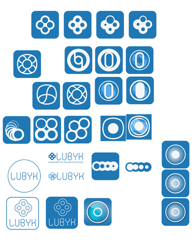
first ideas
developments over the ‘animal’ idea
We settled for the four circle shape (cells, ecosystem, proximity, etc):

logo and font choice
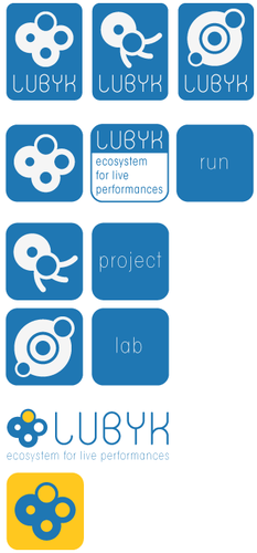
Application icon
Now that we have the logo, it is time to build the actual “app” icon: something that has to live in a dock, a filesystem, etc. We want an icon that stands out a little by it’s strangeness, something appealing but not too candy.
Here are the last contenders for the application icon in different contexts:
in a large filesystem icon view
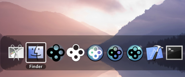
small version when listed in the Finder
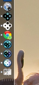
in the dock
in the application tab
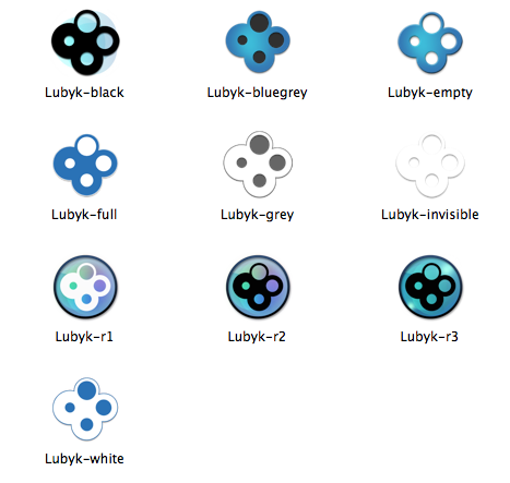
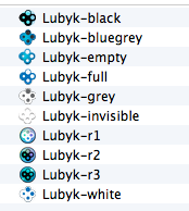
Final choice
Not decided yet…
Highlights
-

received funding for interface
Funding from the Swiss Federal Office of Culture to write the graphical frontend to rubyk !
-

Switched to mono-threading
Moving from a global mutex to a global select/poll loop.
comments
hi gaspar,
i like the shape of the icon and i like the black and white one, (or grey and white?) for my eyes, it is pure and direct like realtimeprocessing, without any design of color mix or shiny shadows.
best daniel
white version, second in the docks! love love it, and still haven’t a white icon around!
very clear and visible.